
Designing for the Pallion Ideas Exchange
October 2, 2012 by mandytang
To support the Pallion Ideas Exchange, we have created numerous printed materials including posters, worksheets, postcards, work flow diagrams and eBooks. These have been designed to help record concerns, hopes and aspirations, which could then lead to further discussions and point to the right person who may have had the same experience.
The design ideas behind these printed materials relied on the feedback and conversations the team had gathered with the members of the community in Pallion. It became a highly iterative process of adapting earlier work though co-design and initiating and making new pieces such as the workflow sheets as a response to ideas and suggestions that had been gathered in our workshops.
The main consideration when designing, was the importance to keeping it visually simple and informal. One example being in the eBooks, we didn’t want to create pages that may put people off by making it look too similar to application forms, but we wanted the eBooks to have a familiar structure for people to fill in with ease. To overcome this, I simply drew the boxes by hand; adding a folded corner and colour coded the outline to indicate the page sets. We agreed that the hand drawn method seemed more approachable and was implemented on all the other printed materials.
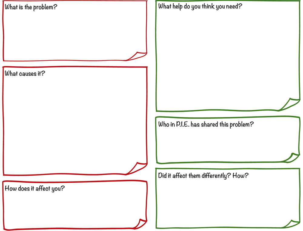
From the “Managing a problem” eBook
The illustrated scenarios had to be within an informal environment and drawn simply, but most importantly; approachable. So instead of my usual mannequins which you may have seen in previous projects, these illustrations of people had a very simple outline. The props and environment were kept minimal, with only flat colours highlighting the activity. With this a library of illustrations were created for the team to use.

Examples of some of the illustrations; the one of the left is someone giving advice to another, and on the right is of an activity.
The most challenging part of the project when illustrating was creating the three “Aspirations” images that are used in the “Visualising the network” map to reflect what the community hope to achieve in terms of “social cohesion”, “a better local environment” and “better life opportunities”. Each had to reflect various aspects in a single image, most of which were easy to explain in words but to frame it in one image required a lot of conversations amongst the team and just thinking about situations which we ourselves may have experienced or seen. The process for this particular part of the project was to think of how each aspect would be illustrated individually and gradually piece them together and tweaking it to make it work as one whole image.

Visualising the network map
Although at first we weren’t sure how the “Visualising the network” map should look like we used these three aspiration images as a starting point and the rest was straightforward. Having created a library of illustrations for activities and resources for PIE that we’ve used across the project, I re-used many of the images so that they will become easily recognisable.
These image files will become part of Proboscis’ forthcoming Neighbourhood Ideas Exchange Toolkit along with generic versions of the posters, worksheets, work flow diagrams, eBooks and postcards we have developed for the Pallion Ideas Exchange project. With this toolkit we hope to inspire others to adopt and adapt the parts for their own local social innovations.